Why are projects late?

It’s this time of the week again, time for another episode of (drumroll) SD Action!

Last time I introduced a basic project management model, this time let’s look at what this baby can do.

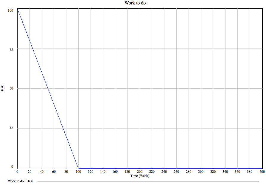
Let our base project be a project with 100 tasks. The team size is 200 people, each of whom can accomplish 0.005 tasks per week, this leads to… Oh, I don’t know. Here’s a graph:

Yup, the amount of work to be done (see the previous post for the model framework) goes down at a steady rate and the project is done by the one hundredth week. Nice. I can hear the more experienced project managers go “yeah, right!” Nothing ever goes as smoothly, people make mistakes! You’re supposed to add buffers and such, 30% is the standard practice.

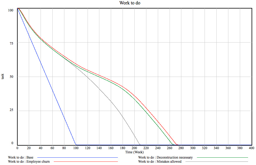
Hm, let’s see what happens if we allow people to make mistakes. On the model, this amounts to there being 20% of chance of a task to have the need to be re-done and the rework generation and discovery flows kicking in. Given the one fifth chance of a mistake, how much should we add to the project duration? 20%, right? Not exactly. You see, you might make mistakes on the bug fixes as well… You guessed it, here’s a graph:


What kind of sorcery is this? The project duration did not grow by 20% and not even 30%. It grew by 110%! Blimey, we just missed our deadline.

Oh well. Sure. Mistakes happen. But what if the mistakes are costly, generating more work to remove the previously done stuff? Remember the example of having to chip out old concrete before pouring new. Here we go:

Yes, this added another 55 weeks to the project. This is one year. By allowing mistakes to cause additional work. Of course, the relationships are more subtle but they are way too geeky to explain here. The deconstruction rate depends on how much of the project is done: it is 0 for about 50% and grows to 1 (in the later phase, as much of effort goes into deconstruction as into rework) as the project progresses. These assumptions are probably different in your field but in my world, one year got added to the project by making a fairly reasonable assumptions of mistakes costing effort.

As said earlier, the team size is 200 people. Given that at this point we are looking at a five-year project, it would be reasonable to assume that there is employee churn. Of course, the newcomers must learn the ropes before they can be productive and, in fact, the entire team starts out this way having about half the productivity. Let’s assume there is 10% employee churn annually, hiring is started immediately to replace the leavers (6 weeks to fill a position on average) and that it takes four weeks to get acquainted with the project.

This is actually not half bad, we loose only 5 weeks or so. It turns out that 10% churn in 200-person team is not a big deal. What is curious, though, that most of the lag is caused by the the fact that the team size actually goes down. How come? You see, given the parameters, the churn turns out to be faster than hiring. People leave until annual churn drops to the same level as hiring and stops there, the model stabilizes. In our case, this means there are 195 productive people, 3 people are constantly in incubation and 2 are just lost. This is where system dynamic modeling excels: solving this symbolically would have involved constructing and solving a system of differential equations but I just drew a couple of boxes and pressed a button.

How many of you have spotted a fatal flaw in the model? You did? Right! Give the gal a cookie!

Let’s give others a moment, shall we…

Yes, right. The thing is that the current model assumes testing starts immediately. The moment anybody writes a line of code or draws a line, it gets tested and, after a while, possible mistakes end up back at the work queue. Unfortunately, this is not how stuff happens in many cases.

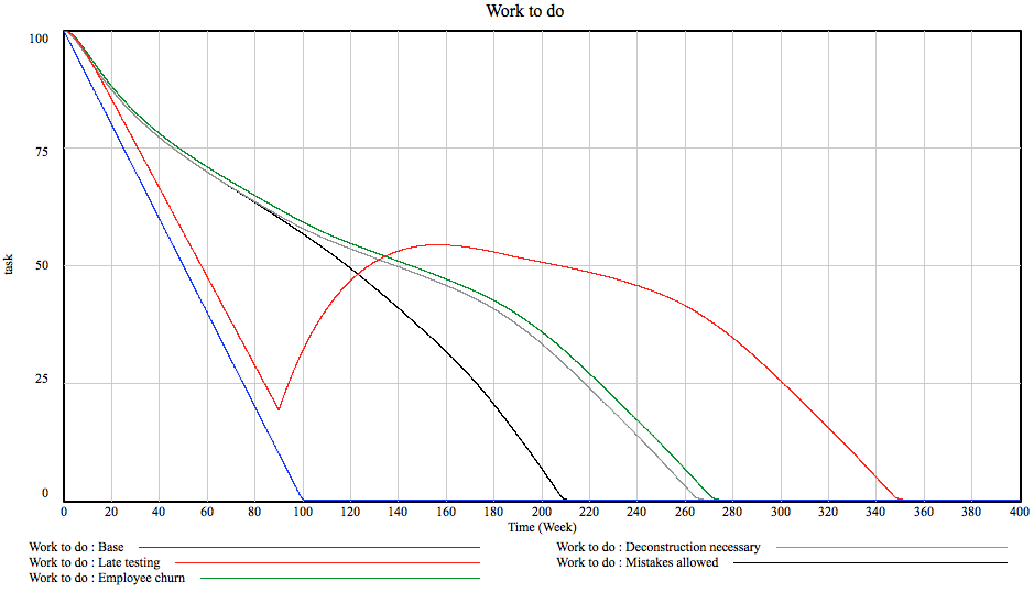
Let’s take construction. Firstly, the architect dreams up a house. Then a bunch of engineers figure out the structure of the thing. Then people come and work on pipes, ventilation and drains. And finally somebody devises a loom of electric wires. And then people go and start building it only to discover that a ventilation duct must pass directly through a structural beam. And a cable ladder crosses a flight of chairs. At about chest height. Bummer. With the way construction is done in this country, I’m assured, there are very little means to discover such mistakes before construction actually begins. In our model, I’ve made it so that there is no rework discovery until about a third through the project, then everything proceeds normally. This is how it goes:

Sweet mother of baby Jesus! 80 weeks! Of course I’m overdoing things a bit. Some testing does happen earlier. True. But the current model does not account for any customer spec changes or for any risk materializing so, broadly speaking, the order of magnitude – about 30% – should be in the ballpark. What is worth, though, is this:

The graph shows the ratio of percentage of work actually done and the percentage of work believed to be done. For all other cases, it peaks pretty early on and starts declining nicely but for late testing, it remains very high until very late. For a project manager this means that they have no idea whatsoever how the project is progressing. Which is a Bad Thing ™.

Let’s recap. By adding only four simple aspects of project behavior, our project has grown 350% in the worst case and about 250% for sensible testing behavior. And we still have not talked about risks or awkward acceptance tests or multiple contractors or, or… Oh God.

See, this is why projects are late. Project managers are faced with dynamically complex systems that can go off on wild tangents for any reason and usually only have their gut to rely on. Of course, being under deadline pressure and lacking concrete evidence they give in and promise these 100 weeks or possibly 150. Well, they should go and simulate their project model and see what comes out the other end. In short, they should observe System Dynamics in Action!
Tagged , , , ,

On managing projects

Projects go wrong. They often do. They tend to go wrong inexplicably, when everything was just about done. They go wrong by orders of magnitude, we hear about a massive project costing billions being closed every other week. What the hell? How come? I mean, these people get paid and get paid well and they still can’t manage a project to be on time, on budget and bang on functionally?

Well, I guess they just can’t help it. The reason, as point out previously, is that humans are notoriously bad at predicting the behavior of even simple dynamic systems let alone a billion dollar 3-year project involving thousands of people in tens of companies.

And you all know what’s coming now. SD to the rescue! Simulate!

This and I suspect a couple of following posts will be on project management and thus it would make sense to establish the basics before plunging into modeling details. This is the basic model structure we’ll be using:

The model assumes that there is a set of work to do and that the work is divided into tasks. The tasks might be writing code, digging holes, it doesn’t matter. The main thing is that work flows out of the “Work to do” box towards two others: “Work done” and “Undiscovered rework”. You see, when you do something it might be OK or it might need changing later. Because you messed up, because somebody else messed up, it does not matter. The main thing is that you don’t know in advance if your work is indeed correctly done or needs to be re-done. That undiscovered rework flows back into work to do via process of rework discovery. Which for us, software folks, is simply called testing. We go “oh, dang” and more work appears on the todo list. Finally, there is a stream flowing in to undiscovered rework called “Deconstruction work”. This one counts for the need to demolish the incorrectly done work. When you pour 200 square feet of concrete incorrectly, you need to bang it to tiny pieces with hammers before it can be poured again. That sort of thing.

Of course, the model as depicted is just a scaffolding. The whole model (based on schoolwork in certain MIT courses but heavily modified) is too complex to go into detail here but the surrounding details can be roughly divided into following parts

  • Scope changes like scope creep, customer changing their mind etc. These things mainly influence the “Work to do” box
  • Personell issues like employee turnover, staffing decisions and such. This is going to have an impact on work flowing out of the Work to Do box. In trade magazines, this is called “productivity”
  • Rework discovery and impact. When and how testing happens and what is the nature of the bugs discovered including the amount, extent and dynamics of deconstruction work

At this point you should be going “dang, this is complex”. You are? Good. Because projects can be incredibly complex. For once, it is not trivial to estimate what the actual amount of time spent on the project would be. Even if you know what the estimates for the factors are, the math is non-trivial and you’d unlikely to be right on the money based on a gut feeling.

We’ll going to go into some more details in the following posts but here are some things this sort of modeling can do for you:

  • Deadline and resource estimates for large projects. Given the process model of your project, given the conditions, project size etc., what does the work estimate and load dynamics are going to be?
  • Process optimization. What happens if we change our development process? What happens if we start testing earlier? What happens if we start doing regular instead of continuous deliveries? Changes in staffing policies?
  • What-if analysis. Given our current project management framework, what happens if half of the team leaves? Customer adds a ton of new requests?
  • Root cause analysis. Our project went like so. OH GOD! WHAT HAPPENED? Model your process, make the result match your project and see if the results improve if you change the policies

Project management is one of the areas, where system dynamics has the most immediate and tangible practical application so the next couple of weeks are going to be interesting!

Allright, that’s all for now. Take care and observe System Dynamics in Action!
Tagged

Viral growth and population size

I did it again. Oops.

Previously i made a statement about how infection spreads faster in a small community. It turns out that I was wrong. I ran the simulation for the estimate for the total number of internet users in the world and Estonia and, blimey, the numbers came out the same – in both cases, the growth rate is the same up to the point of explosion. When that happens, the larger population, naturally grows faster and flatlines on a higher absolute number (but, curiously, on the same relative percentage). This comes down to the fact that while a smaller population increases the probability of contacts with the infected person, it also decreases the contact frequency by the same fraction.

And yet, I can’t help but to feel the population size should matter. Our social networks are not uniform, there are clear clusters of people around. There is also clear empirical evidence with Facebook growing in small communities first and obscure countries like Estonia being over-represented in places like Orkut. But the model presented in the previous post is pretty damn irrefutable, anything I can think of is basically an extension of the same model and thus is likely to exhibit the same behavior. The reason, I believe is in the infectivity rate. I think that the network can go exponential locally. If the particular way a particular network implementes infectivity matches with the particular modus of social interaction within a community, the infectivity rate between the members of the community goes up and the network gains speed. And this, of course, is easier to do locally than globally. One might have a very particular idea about what exactly Estonian teenagers are thinking about right now (think rate.ee) but it is much harder to devise something that appeals to Estonian, British and US teenagers as well as Chinese PhD students. Of course, just supporting Estonian teenagers is not enough and copying the system to Latvia is not going to work as you’d loose all the mass pull effect of the established community while also risking getting the infectivity parameters wrong.

So there you go, one of the answers to MJ’s question “how do we detect things that are about to explode before we do so we can get filthy rich” is as follows. You look for things that are catering a local target group very well in a way that is scalable without copying. Colleges, kindergartens, office environments. Things like that.

One other thing that is clear from the model presented previously I did not point out is the lack of the concept of an “active user”. They do not matter. You might have hundred million people coming to your site to look at stuff but unless they actually create something provoking comment, begging for a “like” or asking for support in a mob war, there is not going to be another hundred mill.

So there’s a second answer to MJ’s question. Look for companies that do not track active users but track contributing users instead. Look for ways a company makes it easy to get infected without triggering the subject reaching for a face mask (very infectious diseases do not spread because they become known and the number of contacts goes down because of public awareness). Look for companies that understand that distinction.

Allright, that’s all for now. Take care and observe System Dynamics in Action!

On virality. And kitties.

It’s Friday again and thus time for a new post. I promised to discuss how to recognize apps that are about to go exponential and some of that thinking will fix the issues that have been pointe out with my FB model (users never churning but rather becoming less active over time, for example). But before we can get to that, let’s talk about what is viral growth. To do this, I’ll resort to one home assignment of last summers ESD.74 class (taught by professor J. Bradley Morrison at the MIT) simply because it covers the very topic. Viruses. I’m using this model mainly because whatever I’d come up with would look exactly like this simply because of me having taken that course. There you go.

The model looks like so:

The three main stocks are pretty self explanatory the only tricksy part being that “Recovery Rate” is both the speed at which people recover from SARS is the same speed at which the population of susceptible people grows. Simply put, people who recover, become susceptible again, there is no immunity. Otherwise the model is based on the idea that infection happens when an infections person has any sort of contact with a healthy person and the number of such events depends on the likelihood of the person you are contacting being healthy and the number of contacts people have.

The model has the following key variables:

  • Infectivity, that defines the likelihood of a contact leading to infection
  • Total population defining the scale of the problem we are observing
  • Contact frequency determining the number of contacts each person has on average per unit of time
  • Recovery rate that defines both the speed at which people stop being infectious and the average time people can infect others

In order to put all this in a better context, let’s use an example. An example, hm. Wait a minute, a friend just sent me a note and there’s a link in there. Click. Oh, a KITTY! OMG!1!!! Hilarious! Gotta share it…. Nope, back to blogposting. And there’s our example.

  • Infectivity now means the probability that whoever sees the video I shared is going to re-share it
  • Total population is the size of my world, i.e. the number of people on the Internet that are in my n-th degree friend cloud with n being reasonable small. This, today, is effectively the entire internet population
  • Contact frequency is the number of times a person on average sees something shared by their friends in any medium
  • Recovery rate is slightly more complex. It is not simply the period during which I send out the links, it is the period during which people are likely to see your link. In FB context, this depends on the time your link remains visible in the news feed before it gets buried under new stuff as well as how long do you keep sharing the video for

Allrihty, let’s take it away.

Let our base case be 2% infectivity (a surprisingly small percentage of people finds kitties amusing. I don’t get these people), everybody seeing an average of 20 kitty videos a day and let the video be “infectious” for 3 days. All fairly reasonable numbers.

What is remarkable is that for the first 150 days nothing really happens. But during the next 150 all hell breaks loose and we hit 90 million cases. This is one of the reasons these things come as a surprise: the explosion takes time to ramp up and people tend to forget about a kitty video pretty fast.

Let’s now consider what would happen if our video was really really cool. What’s cooler than a kitty? Two kitties. Fighting. To the music of Burzum. This would amount to infectivity, oh I don’t know, 3 per cent? Sounds reasonable? A graph showing the current number of people rather than total tells the story:

Oh, bummer. Not only does the explosion happen five times sooner it is also much quicker and results in three times the infected population!

This is scary, right? As an antidote, let’s see what happens should infectivity be only slightly lower, 1.8% instead of 2. As a result of, say, the subject of your share failing to mention kitties. Or Burzum.

I actually had to resort to excel to get this one to even show properly. Yes, the vertical axis is now a log scale and while our base case dealt with millions of people the video with a slightly dull title deals with thousands. Zero point two percentage points difference in infectivity levels yields three orders of magnitude worse performance. By the way, isn’t it cool how the log scale makes the curves all straight outlining the exponential nature of the phenomena we are observing?

I won’t burden you with another graph but the effects of playing with the infectivity period are almost as severe: 2.8 instead of 3 days gives about 31 thousand instead of 3.6 million users within our period.

Obviously my goal was not to educate you guys on kitties, I had a couple of points to make. And lest my storytelling skills foil this mission, let’s lay them out nice and straight:

  • Exponents are weird! It is really hard to grasp how exponents work, especially in complex arrangements. Human mind is just not built for this.
  • Small lapses have big impact. Even minor changes in how your viral campaign is set up will have a massive impact on whether you’ll reach millions or hundreds of users. Note that the differences I’ve played with here are almost within statistical margin of error. Hence, even if your do everything perfectly but your estimate on how long your video will be visible is just a wee bit off, the campaign is going to be a big flop. Or, a moderately well-executed campaign might explode simply because the stars were aligned just right

Allright, that’s enough SD Action! ™ for today. See you next week!

What would it take to topple Facebook?

Since the previous post got a lot of good feedback and a ton of comments. Let’s follow up.

The question is, why is G+ flopping? I mean, its like a desert, Steve Yegge’s rant is the only piece of content I’ve ever found there. And even that was referred to from somewhere else.

In a wider context the question is, what would it take for something brand new to take on Facebook and significantly alter the behavior depicted previously. To answer this, I amended the model:

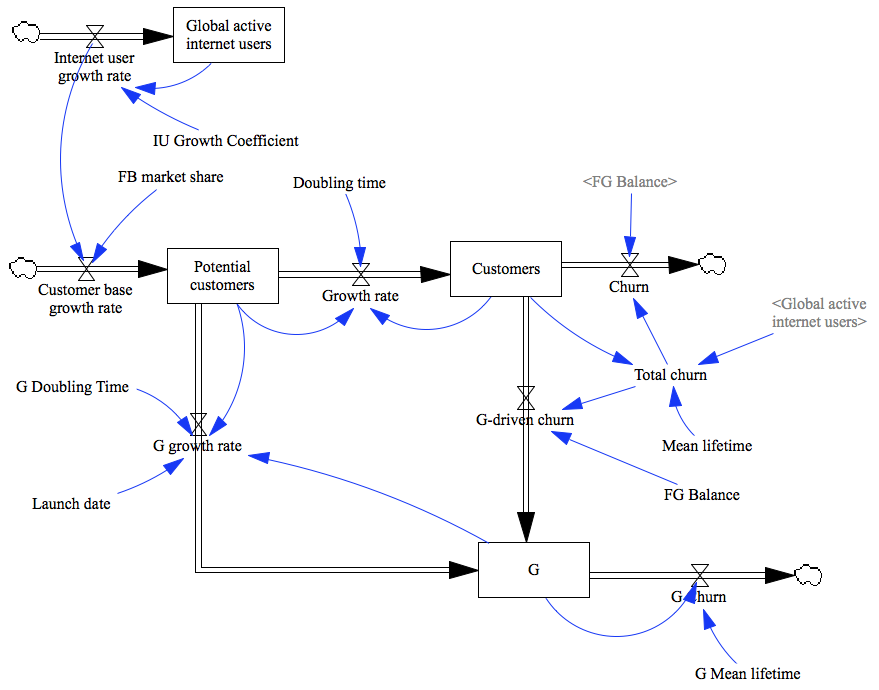
As you can see, it is now considerably more complex. There is now a new box ingeniously labelled “G” and a flow from potential users that fills it. By doing this, an assumption is introduced that the potential customers of Facebook and the new service will overalp. There is also a flow from “Customers” to “G” and considerable changes in how churn is calculated. Previously, as you might remember, churn was just a function of how many users Facebook has and depended on the average lifetime of active users (whatever the definition of an “active user” is). This is slightly unrealistic: the less users facebook has, the less reason for people to be there as the chances of majority of their friends not being active goes up. So I fixed that. Total churn is now calculated like so:

Customers/(Mean lifetime*(Customers/(Global active internet users))^0.07)

The “0.07” effectively determines how fast the function approaches 1, i.e. how much impact the outside world has on churn. A new variable “FG Balance” determines, what percentage of the people leaving Facebook would become active users of the new service.

Let’s now take a look at how these changes affect what we can say about the future of Facebook. Let’s start simple and just assume that the new service is after the same user base but that the existing Facebook users are extremely loyal and there is no leakage, this shall be our scenario “G”. The G doubling time parameters are set to match what is known of G user base, mean life-time is the same as for FB and the service is set to launch on day 2692 of Facebook Reckoning with 2.5e+07 users. The reason for this is that the behavior of the networks is very different in the beginning and at scale simply because their target community changes so much. Remember how Facebook conquered one small college market after another (why this matters, is a small thinking exercise for you, my dear reader)? Remember the rush to get early G invites? Anyway, here we go:

Yup, there is no way the new service will catch up with Facebook like this. Even when we make the new service virtually explode by making it grow three times as fast as the figures suggest (scenario “Super_G”), it will not overtake Facebook before 2015. The reason for this is simple: scale is king here. The more users you have, the more you attract. Thus, tapping potential customers is not enough, G needs to attract FB users. Let’s see what happens if a third of people leaving FB would join G:

Oh my. Even for that rather generous case, the blue line crosses the red one in about five years… In both cases, it is interesting to note te effect on Facebook: for both scenario its fundamental growth pattern does not change. It will flatline a while longer or loose some customers for a while but it will eventually continue to grow and grow fast.

This is not looking very promising, is it? Let’s dial everything to pretty much eleven and picture a scenario where two thirds of all people leaving FB would join G and that the competing service is so attractive that the average half-life of FB users drops 30% (Scenario “G_Super_Pull”):

This is much more interesting. FB general behavior does not change but G growth takes a sharp turn up as soon as FB churn peaks. Which is right about now, more or less. Ergo, a similar scenario might be happening and we don’t know it yet. That said, the input parameters are pretty outrageous and very unlikely to be true and the FB should have less users now already. Still, it is curious to think that G might be about to overtake Facebook and nobody knows it yet. Interestingly, changing the percentage of Facebook churns converting to G has less of an impact than the overall increased churn of Facebook.

Interestingly, the fundamental modus operandi of Facebook will not change: some scenario prolong the flatline phase and some induce a small decline but all the lines point up. Playing with the “effect of the outer world” constant has little impact as well.

The main conclusion I can draw from this exercise is that Google needs to actively target Facebook users, convert active facebookers who are happy with the service to active G+ users to have even a remote chance of making a dent in their armor. Rapid user acquisition would not do, only conversion. And the conversion rates must be very high indeed.

The second, and more important conclusion seems to be that one needs to mess up royally to loose in the social network game. The amount of people joining the interweb is so large that even with massive churn and people quitting in favor of your competitors, there is still a huge crowd of people to recruit. Which is something I would not have thought.

As we are done now with the analysis part, it is probably appropriate to point out that this model has an important flaw. It assumes that Facebook and Google define active users similarly. This is unlikely to be true: Google calls even their reader app part of G+ so God knows what their numbers might actually mean. It was also pointed out that there is actually little churn in social networks, you just don’t stop by as often as you used to but you never churn. And there is the question, how can we use such insights to predict future growth.

But, yet again, the ink in my pen has dried and the answers need to wait until next time. See you around!

Will Facebook peak?

I had an argument. Not that this is peculiar per se but I had an argument about Facebook. On Facebook. It was about FB buying Instagram for $1B and I told a friend that “Facebook will peak, trust me”. I never thought to doubt this assumption as I figured that eventually the supply of potential customers would run out, churn would take over and it would be downhill from there as the less users there are the less reason it is for others to be there.

I was wrong. I should have known, really. Its a shame I didn’t. Stuart Fierstein once said “There is no surer way to screw up an experiment than to be certain of its outcome”. All of the system dynamic education teaches you that humans can’t predict behavior of dynamic systems.

Oh well.

Anyhow, I decided to run the numbers and so I did. Using Vensim, I built the following model:

Let’s walk through it. First thing to consider is that FB does not operate in a vacuum or a world of infinite users. They can only reach people who actively use internet. That’s the box “Global active internet users”. Based on Google Public Data (which is awesome, by the way) one can extrapolate that this number multiplies by roughly 1.00037437 every single day (that’s the “IU Growth Coefficient”). It can be assumed that a certain percentage of the people adding to the global internet community will be potential FB customers but not all: not everybody speaks a language FB is available in, not everybody likes FB or has time for it. I assumed that 80% of people (the “FB market share variable”) would, indeed consider becoming a FB customers. Thus the FB potential customer base (labeled as such) grows by a number that is called “Customer base growth rate” on the model.

However, not all of these people instantly become FB users. It is merely a base from which FB can recruit new ones. The speed at which this happens is dependent on three factors. Firstly, the doubling time (i.e. the time during which as much people would become customers as there already are). This is measured in days and I used 250 for the simulations. Secondly, the user base growth rate depends on the number of customers FB already has for a simple reasons: the more users there are the bigger their joint community of friends that might join FB. However, this effect is countered by the third factor, the potential customer base. The thing is that the smaller the community from which the customers could come from, the higher the chance that the friend networks of individual users overlap. Simply put, if FB had 10 users, these users would have about 400-500 friends and 1000 users would have ten times more. But if there was just 1000 users left who are yet to join FB, they’d be bound to be connected to _somebody_ already there. Clear? Didn’t think so. Think about it and it starts making sense, though. If not, there might very well be an error of reasoning in which case please be so kind to leave a comment.

Alright. But there is also churn. In order to keep things simple, churn is signified by mean tenure of a user, is represented in days and is 1095 days or three years in our case.

Finally, there is the issue of time. In our simulation, day 0 is the day of Facebook launch and all models start from when there is the first available user count: FB had 100 000 000 users as of 4th of February 2004. This means that today is the day #2949 of Facebook Reckoning.

And that’s our model. Of course its a very simple one and does not accurately depict a large number of factors impacting the growth of a social network and it makes a large number of assumptions (that churned users never return, for example). It does however match FB growth numbers pretty accurately and it is hard to see fundamental fault in the logic presented above. If you can spot one – do let me know. That’s the beauty of SD analysis: you don’t have to be right on money with your numbers, you want to have the relationships roughly accurate instead. You’ll be after general behavior rather than an exact user count at a given time.

So I ran the model. The result? Here:

The line to watch is the blue one. It is obvious that it does not peak. In fact, it flattens out right about now (how about that?) and stays flat for about two years before climbing again. The reason for this is not so obvious. If you look at the blue and grey lines (FB users and global internet users respectively) you can see that they move about parallel for a while. The red line (potential customers) of course goes down as more and more people join FB and not enough people join the Internet community. At about day 2635, FB join rate peaks before starting to fall as there are simply not enough people who use internet but have not used Facebook. And so there is a decline in growth rates up to about day 3300 where the black and green lines cross. What does this means? Simply that at that point the Internet grows faster than Facebook. Hence, the potential user base starts increasing again and Facebook adoption starts slowly climbing up.

Pretty neat, huh? Besides being exceedingly cool in my geeky mind, all this has following very real business consequences.

  • Don’t panic! Yes, your growth will be flat for a while but this is not because you are doing something wrong, it is because you have outgrown the Internet. Keep cool, calm down and it will be allright. The biggest danger here is that flatlining AU numbers mean flatlining revenue numbers and that spells trouble. A temptation is created to drive up ARPU which results in stronger advertising pressure which is likely to drive away users, slow growth even further (remember the friend-of-friend concept of growth) and ultimately start a death spiral (the less users the less reason for others to be there)
  • Recruiting new users is actually dangerous, you are better off making sure they don’t churn. The following chart tells the story. The green line is the user count for our base case, red line shows the case with mean user lifetime increased by 30% and the blue one the case where adoption rate was similarly increased. The trouble with increasing adoption is that it just makes you spend you user base faster and increase the time it takes for the Internet to catch up with you. Focus on keeping your existing customers instead and the increase can be substantial

Of course a disclaimer goes with all this. All models are wrong but some models are useful. Into which bucket this particular model falls is up to you, my dear reader but this is simply a couple of lines and boxes on a computer screen and not the huge business Facebook has become. So no fingerpointing should I turn out to be wrong, OK?

Finally, I’d like to say that there is a ton of interesting things these sorts of models can explain. For example, I’m pretty sure G+ being a slosh has a simple reason related to SD, it would be cool to simulate increase in advertising pressure and so on and so forth but let’s leave it all for some other time, shall we?